
The Trouble with Skeuomorphic Design
03 Mar 2012
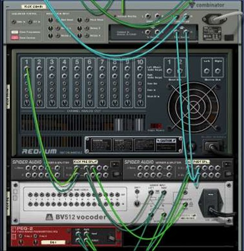
Take a look at that picture for a second or two. If you can tell me at a glance what absolutely any of that does, that you are a much smarter person than I. (Or a producer. One of the two). That's a screenshot from the popular Reason audio software, and in my opinion it's an absolutely terrible design. At a glance, it's cluttered and non-intuitive, and non-functional elements waste space on the screen. Its design is governed by something called a skeuomorph, an extremely prevalent concept in digital interfaces.
What is a skeuomorph?
According to Wikipedia, a skeuomorph is "a derivative object that retains ornamental design cues to a structure that was necessary in the original". More simply, a skeuomorph is a design that retains elements of a predecessor or previous design, purely for visual purposes. Even that may be a little tricky to grasp, so I think the best way to become familiar with skeuomorphs is by example. They're just about everywhere we look - I'll focus on skeuomorphs in digital designs, although there are plenty to be found in the physical world as well.
Skeuomorphs in the wild
Digital skeuomorphs are absolutely everywhere. The floppy disk icon for Save, or the scissors to Cut have become ubiquitous, and the paint bucket is classic in illustration programs. And what about the fact that we sort files on our computers into 'folders'? On the web, retailers hold your items in a shopping cart, and buttons seemingly depress when you click them. One that's always annoyed me is the artificial shutter sound on cell phone cameras; regardless, someone thought it was important enough to make a default setting. Many of the digital interfaces we interact with on a daily basis are governed by skeuomorphs without us even thinking about it. But why such a focus on potentially outdated design elements?
Why do we use skeuomorphs?
Most technology has a learning curve associated with it. Skeuomorphs are used to make the transition easier, and to make a new design or concept feel more comfortable and familiar to us. Certain skeuomorphs are universally recognizable, and enable consistency across applications. Others drastically improve usability - Amazon's Kindle is a great device, and it's incredible easy to use because it mirrors the experience of paging through a real book. These are elements that we've come to expect, and they certainly have their place. But I'm writing this post because I think an over-reliance on familar elements can be harmful. The screenshot I posted from Reason is a particularly extreme example that characterizes what happens when too much focus is on emulating a predecessor. At its core, the modular component idea is nice. But the dangling wires clutter and complicate the screen, and extraneous elements such as power cables or cooling fans are gross wastes of space. Alternatively, think about calendar software. Let's say it's late in the week, and you're looking at your weekly view. It's common to see previous days, maybe grayed out, but still present and taking up space. This is a skeuomorphic relic of physical calendars, but digital calendars give us the power to do better. A rolling display containing the week ahead of the current day is a much more efficient display. Simply shifting our focus away from skeuomorphs can allow for much more efficient and elegant interfaces.
It's too late to change
It's hard to argue against the use of skeuomorphs completely. We've come to depend on our familiar interfaces, and even the slightest change would throw people off. Imagine what would happen if a developer decided to use something besides the iconic floppy disk for the Save action in their program. It certainly doesn't seem like a monumental change. But clicking on the floppy disk is a mindless action at this point, and changing it to something else requires thought from the user. Even if it's just a second, people will notice and get annoyed. These skeuomorphs are so ingrained in our everyday experiences that the slighest change throws us off, and so it's difficult to sit here and argue against their merits. It's too late to change the interface elements that we've become so accustomed to. Or is it?
Defining a new generation of experiences
Admittedly, that's a bold title. I try to avoid such grandiose statements, but recent technology has presented us with unique opportunities to define and create new standards of interaction. Think about the common elements of the current generation. My kids will have little context to grasp the idea of a floppy disk - sure, it means 'save', but what on earth is a floppy disk anyways? These things aren't even present in my generation, and yet they live on in our software. The skeuomorphs that are considered perfectly valid (and even expected) in current interfaces are quickly becoming outdated. Computing is rapidly shifting away from the traditional desktop model, and instead enabling an ever more mobile world. iPads and smartphones present an entirely new and more tactile way to interact with our devices, and I fear that too much of a focus on skeuomorphic designs of old spoils the opportunity to create new experiences and interfaces.
Tweet