
Visualizing your bash history with d3.js
31 Jul 2013
I spent the last weekend diving into the world of d3.js, investigating it for a potential project for work. d3 is a framework for manipulating ‘data-driven documents’, and provides an incredibly powerful toolkit for visualizing your datasets in all sorts of interesting ways. It lets you easily create standard representations like bar charts, pie charts, and line graphs, but it’s by no means limited to those; if you like, you can also use it for fancy visualizations like force layouts and choropleths. In fact, it’s unfair to even describe it as a mere charting framework - it describes itself instead as a tool for applying ‘data-driven transformations to a document’. I’m not going to attempt to dive into it all here - I recommend the official site or the tutorials as a good starting point.
As an experiment, I wanted to visualize my most-used commands in bash. Bash maintains a command history at ~/.bash_history, and so I set about parsing that file and then representing that in d3 using a pie chart.
If we’re going to visualize most-used commands, we first have to parse the ~/.bash_history file and map commands to how many times they’ve been called. I decided that I would write a ruby script to comb over the file, and dump results as a JSON file, which d3 can read. The script goes over each line of the history, parses each command, and increments its associated count in a hash. Once we have that hash, we can convert it to a JSON-friendly form and dump it to an output file, commands.json. Here’s the script:
# Parse most frequently used commands out of bash history
# Writes JSON file of the form:
#
#   {
#     commands: [
#       { command: 'ls', count: 20 },
#       ...
#     ]
#   }

require 'json'

NUM_COMMANDS = 13
counts       = Hash.new(0) # cmd -> count
result       = { commands: [] }

# Parse through history file and map commands to counts
File.read("#{Dir.home}/.bash_history").each_line do |line|
  cmds = line.chomp.split(' ')
  cmd  = cmds.first
  if cmd == 'git'
    cmd << "_#{cmds[1]}" # ex: git_commit
  end
  counts[cmd] += 1
end

# Push JSON objects into results
counts.each do |cmd, count|
  result[:commands] << { command: cmd, count: count }
end

# Take only the top n commands
result[:commands] = result[:commands].sort { |a,b| b[:count] <=> a[:count] }
                                     .take(NUM_COMMANDS)

# Dump JSON to output file
File.open('commands.json', 'w') do |f|
  f << JSON.dump(result)
end
The script is a bit hacky at best - I didn’t spend too much time making it pretty. Once we have commands.json, we’re ready to start visualizing our data with d3. The code is a bit long to put inline, but you can see it along with the live results on this bl.ocks.org page.
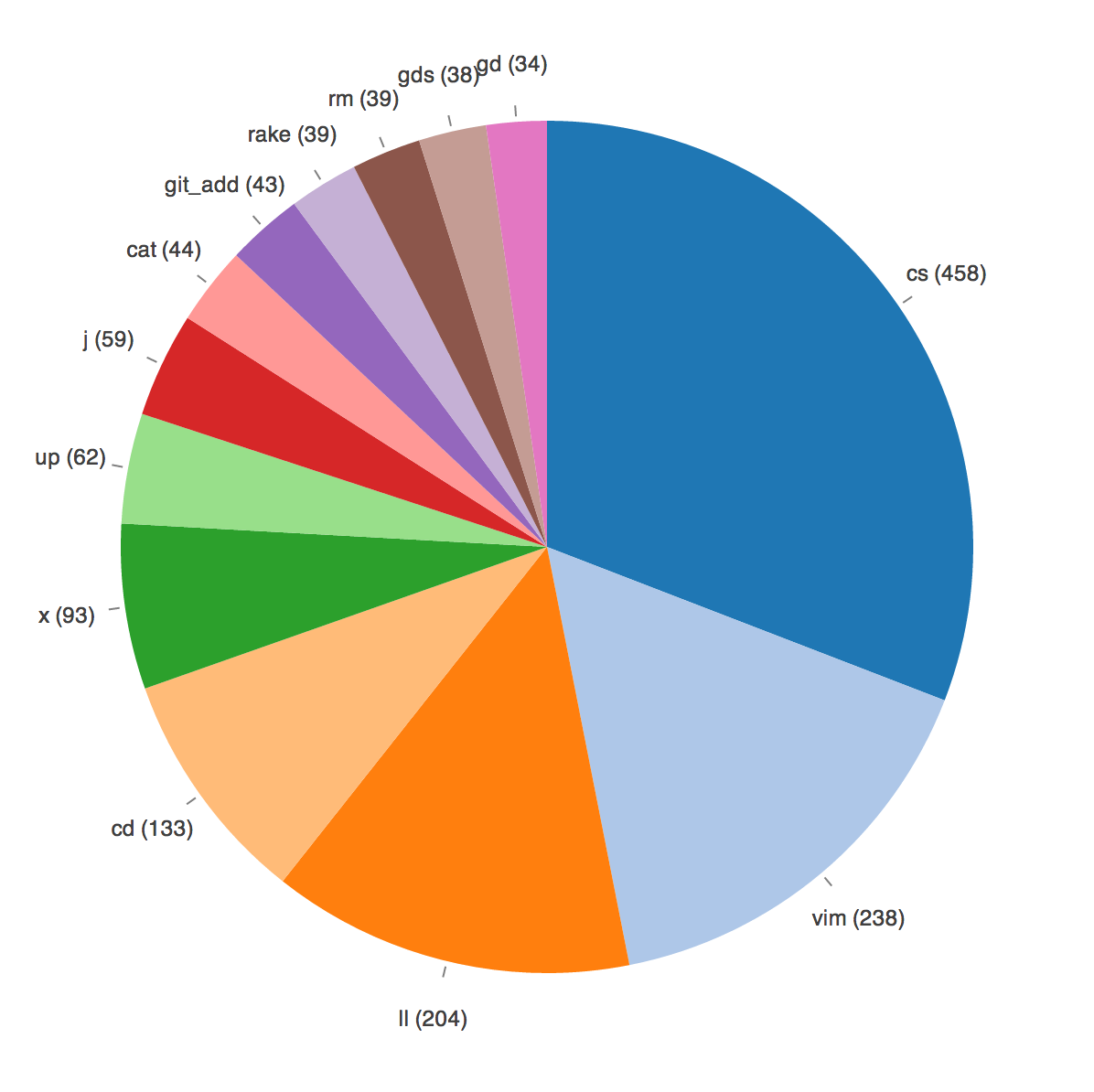
Here’s a screenshot of my results:
Click for larger image
Unsurprisingly, a small number of commands dominate my most-used list. cs is a function I wrote which runs clear and then git status if you’re currently in a git repo, otherwise it defaults to ls -la. I’ve gotten in the habit of running it after just about every command, and I find it a super handy way to constantly keep the state of a repo in mind. You can find it in a gist here.
Vim takes second place after my recent switch from Sublime Text (which I will write about another day). x is an alias for exit, and up an alias for cd ... gd and gds are aliases for git diff, and j is the invaluable autojump at work. The rest is mostly the standard UNIX toolkit. My HISTFILESIZE is set to 2000, which is a decent sample size, and I’ve arbitrarily limited the number of commands shown to the top 13 for readability.
This visualization doesn’t really serve any particular purpose, although it’s a good intro-level d3 project, and it’s fun to see a breakdown of my daily workflow. If you’re interested in d3, this page has all the code for this example, and I can’t recommend Interactive Data Visualization for the Web highly enough. It starts at the basics and does a fantastic job of leading you through the different things are possible with d3. Happy visualizing!
Tweet